Ohlmeyer Insurance Branding
Ohlmeyer Insurance Branding
Ohlmeyer Insurance Branding
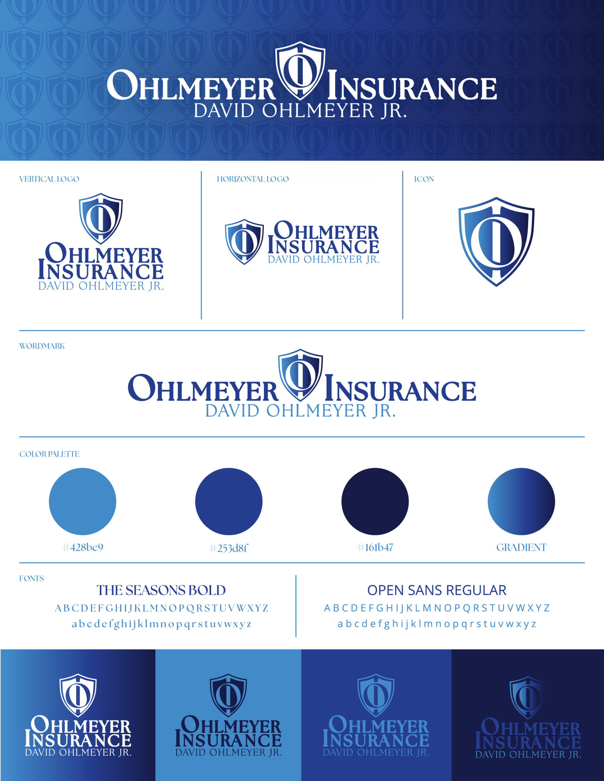
At Ohlmeyer Insurance, we embarked on a mission to craft a comprehensive branding package that encapsulates the essence of their business. Our collaboration resulted in a suite of visual elements, including a wordmark, vertical and horizontal logos, and a versatile icon.
The wordmark serves as the cornerstone of Ohlmeyer Insurance’s brand identity, embodying the company’s core values and establishing recognition and familiarity among its audience. After an insightful meeting with David, we designed the primary logo to emphasize the initials ‘O&l’ integrated within a shield icon, reflecting the strength and security synonymous with the insurance industry. The use of Allstate blue in the color palette ensures brand cohesion, while prominently featuring David Ohlmeyer Jr.’s full name fosters a strong personal connection.
We also created alternate logos to provide flexibility across various branding contexts. The icon is a versatile visual element that enhances brand recognition and allows for streamlined application across different mediums. Additionally, the compact versions of the logo offer practical solutions for situations where space is limited, ensuring consistent brand representation without sacrificing visibility or impact.
Ohlmeyer Insurance’s new branding is not merely a visual identity; it’s a testament to their commitment to providing strength and security, thoughtfully encapsulated in every design element.
Project Details
At Ohlmeyer Insurance, we developed a comprehensive branding package featuring a distinctive wordmark, versatile logos, and a cohesive color palette that reflects strength and security. Our designs emphasize the initials 'O&l' within a shield icon and prominently feature David Ohlmeyer Jr.'s name, fostering recognition and a personal connection.

